University of Idaho:
Class Schedule Website
REDESIGNED A KEY TOOL FOR MEETING STUDENTS'COLLEGIATE CURRICULAR NEEDS
OVERVIEW
A course schedule website is a key tool offered to students by academic institutions to arrange an easy & quick way to view the courses provided during each semester.
The aim of this project was to design an easy to use website that streamlines the process of choosing courses for current students. The redesign addresses the lack of clarity in accessing the main course menu, lack of course search options, & accessibility to course-related information (such as course descriptions, & program requirements) necessary for the registration decision-making process.

THE PROBLEM
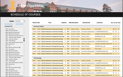
The University of Idaho schedule of courses website is available for access to a population of 18,000.
Inability to access relevant information about courses can be a barrier for all potential users of this website.
The current website lacks necessary features & information for users to make informed decisions about the courses offered.
USER RESEARCH
Initial user research was conducted using information available on the University of Idaho website. My aim was to,
-
Identify key stakeholders of the class schedule website
-
Gain understanding of the goals of each stakeholder population
-
Gather redesign requirements based on the majority stakeholder's needs
I identified the following stakeholder populations & the respective needs to be fulfilled by the UI class schedule website,
Faculty
Gather relevant class information for teaching such as location etc.
Prospective Students
Gain information about classes typically offered to make admissions decisions
Current Students
Find information about classes for registration purposes
Advisors
Find classes to recommend to their advisees
Registrar's Office
Update class schedule & carry out other maintenance tasks
For this project I focused on the current student population of stakeholders.
CURRENT STUDENTS
11,841
Students currently enrolled at the University of Idaho
DEGREE
Students are pursuing different levels of degrees, Bachelors, Masters, or Doctoral
LOCATION
Students take classes on various campus locations, or online as distance
EXPERT VS. NOVICE USERS
A significant part of the current student population (22%) are newly enrolled students. Since students that are newly enrolled may not have been previously exposed to the schedule of courses website, their experience of interacting with the website would be different to those that have previous experience with the website. Thus, when gathering requirements I focused on the users as two separate groups, novice & expert users.
EXPERT
-
User has experience with the current class schedule website
-
Has advanced beyond the first-semester & is familiar with the major requirements of their respective academic program
-
Users want to find all class options quickly & easily, in order to choose elective courses
NOVICE
-
Users are unfamiliar with current class schedule website
-
Users may be unaware of the major requirements of their respective academic program, such as general education requirements
-
Users may have a mental model based on previously used class scheduling websites
ONLINE SURVEY & STRUCTURED INTERVIEW
I sent out an online survey created on Google Forms via email & social media platforms such as Facebook & Instagram. Respondents were asked to carry out a task using the website, & were asked about their satisfaction with the website. I also conducted a qualitative interview with a current student who had previous experience with the class schedule website. The following quotes are extracted from user responses,
"The left hand navigation pane could have been better designed to make it obvious that it was for selecting specific departments, not for courses (as I initially assumed)”
- Novice User
"“It made it easy that I only had to go to two pages to find my course.”
” - Novice User
“I would also like to be able to see the relevant required classes for each major through the course website, without having to refer to other resources”
- Expert User
INSIGHTS FROM USER RESEARCH
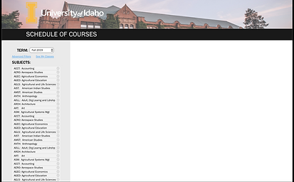
SEARCH OPTIONS
-
Current side menu contains important course schedule information, organized by department
-
Current side menu does not grab user's attention
-
Users could access all courses in a department with only two clicks of a button with current side menu
-
Allowed users to confidently use the website
-
-
Novice users can't search for specific courses due to lack of a search engine
REGISTRATION DECISIONS
-
Users were frustrated as they couldn't view & compare courses from multiple departments in the same window
-
Students had to use external resources to view key information, such as course descriptions & program requirements
VISUAL APPEAL
-
Users indicated the website should be more visually appealing, & align with the overall University of Idaho brand
GOALS & REQUIREMENTS
-
Students should be able to find courses quickly & efficiently in a few clicks
-
Retain students' confidence when interacting with this website
-
Students should be able to further refine course search results to find specific courses
-
-
Users should be able to find all relevant information needed to make informed registration decisions
-
Students should have access to course descriptions within course schedule website
-
Students should also be able to view the required courses for their major without using external sources
-
-
Make website more visually appealing to align with UI brand
-
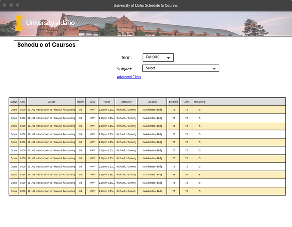
Information presented in the course list display should be minimized to improve readability
-
SETTING UP THE STRUCTURE
Next, I began the initial stages of prototyping & started building mockups. Since users found the discoverability of the side menu to be low, bringing attention to the side menu's content was a main goal in the redesign of the website. To understand which structure of the website would be most suitable for the redesign, I created two low-fidelity mockups & tested them on several users. Majority of users found the first mockup with dropdown menu to be cumbersome, & preferred the second mockup because of the side menu.
PROTOTYPES & USER TESTING
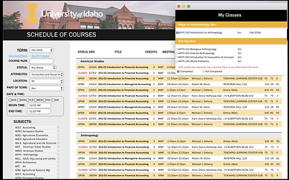
I developed a high-fidelity prototype that addressed the gathered requirements. I tested the prototype using the think-aloud technique with users. The final design included the incorporation of a side menu, a course search engine, & easy access to course descriptions & other information found on external resources. The prototype can be viewed through the following images,


THE SOLUTION
The new class schedule website design would make it easy for both novice & expert student users to achieve their goals by efficiently searching for courses, & making informed registration decisions.

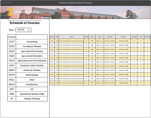
SIDE MENU
By shifting the term selection option to the side menu, the discoverability of the side menu increased. Students can also view courses within a few clicks.
REFINE COURSE SEARCH RESULTS
Students can view & compare courses from multiple departments. Students can also search for specific courses with added search engine.
MAKE REGISTRATION DECISIONS
Students can make informed class registration decisions by accessing information like course descriptions, & program requirements.
